

EverEcco: Screen Shots & Tour - pg5
From version 1 to version 4 of original Ecco, IMHO the Options presentation went from ‘pretty good’ to ‘not so good’ as
features were added. I hoped back in early ‘97 that Ecco version 5 would include a re-vamp of the confusing array of
available Options and set-up windows, which included (and still does:) General, PhoneBook, Calendar, File Properties,
Print, Import and Export. Fast Forward to 2016 and I’m still waiting for version 5. The good news is Ecco has finally
been upgraded. The bad news is the upgrade is not a re-write, it is an ‘add-on’ or ‘extension’. (To-Do --> what is the
difference anyway? I don’t know. Nail down.) To Slang’s credit, EE puts almost all EE Options in one central location - in
the Windows Task Bar, accessible by right clicking on the Ecco icon.
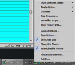

When you right-click the tray icon, you get a pop-up fan-out menu. Not
easy to navigate and understand for some folks ... like me. I think it goes
back to a learning disability called dyslexia. Whatever the case, luckily all
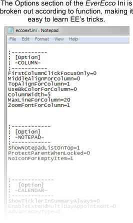
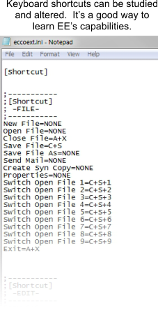
EE’s regular Options and more are available via a Windows Notepad in
what is called an “ini” file. Ini files are quasi-text which you can read and by
using a semi-colon, notations can be made. Like this
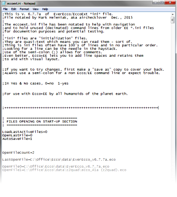

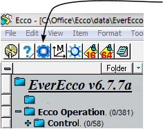
The EverEcco Ini file becomes part of Ecco’s Control
Panel and accessible with the click of an Icon
